Why the change?
Every organisation has a story. Ours is a strong legacy started by families driven by the desire to ensure that they had access to the best information, education, treatment and support. They advocated for acceptance and understanding. They encouraged research and leadership in the community. Since 1964, Autism SA has been single-minded in our focus upon supporting the autism community with a strong legacy of being responsible for bringing many firsts to the community in South Australia and nationally.
Autism SA prides itself on strong values-driven culture of empowerment of, and support for, individuals living with autism as reflected in our Vision:
Our Vision:
Each individual on the autism spectrum lives
the life they choose in an inclusive society
Hence this change also offered the opportunity to herald our evolution without loss of our proud heritage.
The History of the Puzzle Piece
The puzzle piece has for a long time been associated with autism, where it was first used by the National Autistic Society and as a representation of the ‘puzzling condition of autism’. For many in our community, particularly those that grew up with the puzzle piece messaging, this represents an old way of thinking about people on the spectrum as it is interpreted as being a puzzle to be solved -and this certainly does not represent our thinking.
How did the design come about?
The design process commenced with Autism SA providing Isshoni Creative, a small South Australian business with a personal connection to autism, an outline of what autism and the organisation represents in the past, present and future. After a creative process, ideas evolved into a developed concept and a survey was sent to our key stakeholders (staff, the Board, and our community) to seek feedback on the proposed changes.

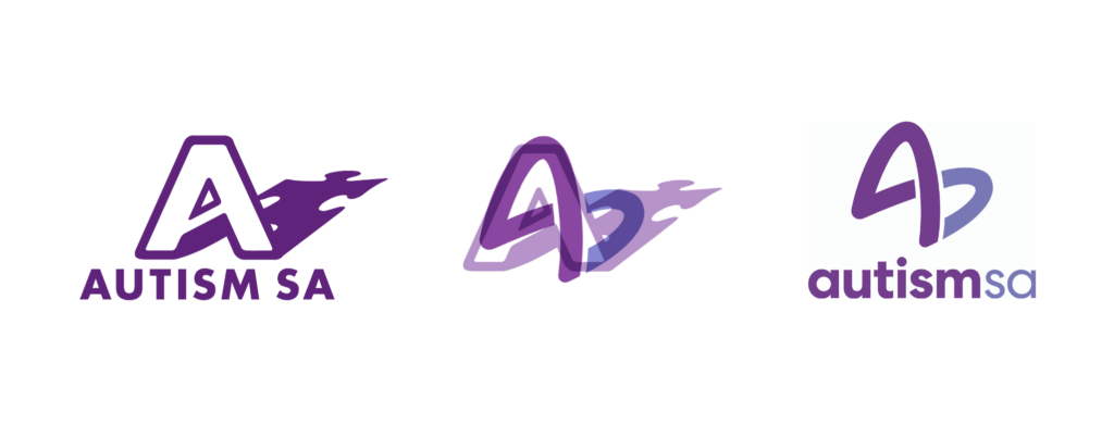
Our refreshed look uses the “A” and the shadow from the previous logo to create a three-dimensional shape. By moving your viewpoint around this 3D shape and looking at it from different perspectives it creates different shapes, making each point of view unique, in the same way that every person is unique. Whichever perspective you look at the logo, each person will see and interpret something different from it. For instance, one person may see the infinity shape which signifies to many in the autism community, the concept of limitlessness, infinite possibilities, and empowerment. It also reflects togetherness and inclusion; another may see a heart, and another may see the wings of a butterfly meaning transformation – the possibilities are endless.
When will the change happen?
Our refreshed look will be rolled out slowly over the next few months, and you will start to see it used across our social media channels, website and more. We are so pleased that our refreshed look represents our passion, mission and vision and look forward to taking you all on this exciting new journey with us!


